Whilst sat at Reading railway station this morning waiting for my train, it occurred to me how little thought advertisers give to the design or the location of their poster.
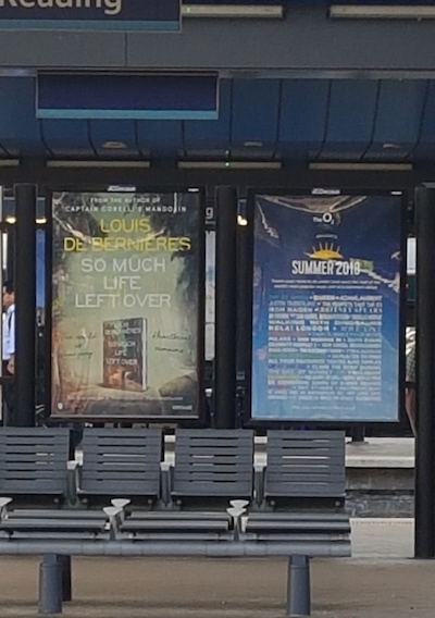
I am sitting looking at 2 posters across 4 lines of tracks and am finding them both difficult to read for different reasons.
The one on the left has white text on a light background which does make it somewhat difficult to read and the one on the right has far too much information written on it.
When designing a poster and especially if it is being displayed at a station, you are not just appealing to those stood on that platform. You are also appealing to people looking across from the opposite platform or maybe sitting on a waiting train, so you need to bear this in mind when it comes to the design.
Focal Point can help make sure your message is clearly visible across 2 or 4 lines of railway tracks.
Our mission is to make sure you get the maximum exposure from your advertising spend.
Thoughts by
Richard Knight (MD Focal Point Advertising)
If you have any question about what might work for you, get in touch. You can Email us at enquiries@focal.co.uk, call us on 01256 767837 or fill out the form on our ‘Contact Us‘ page and we will get in touch.